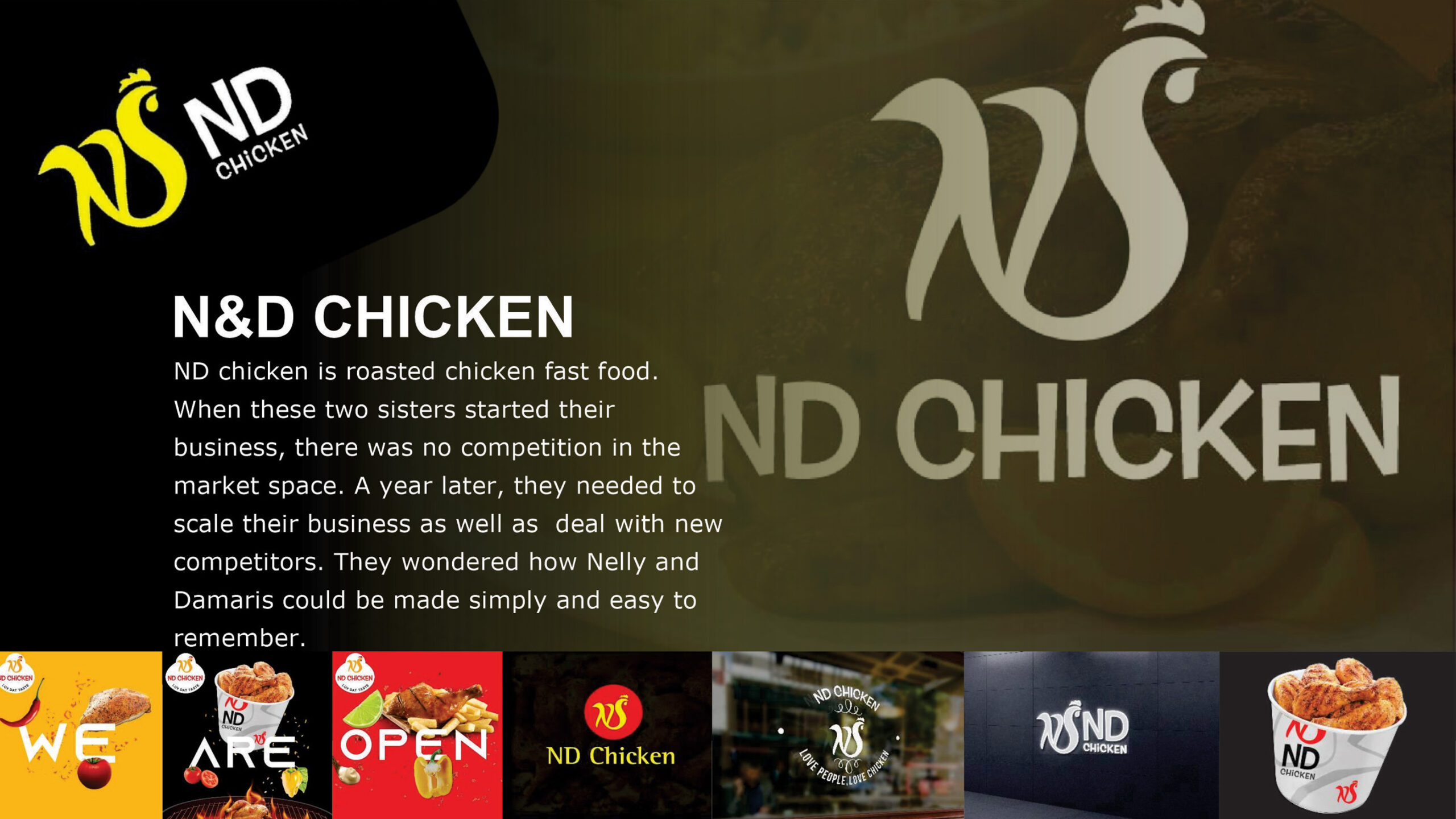
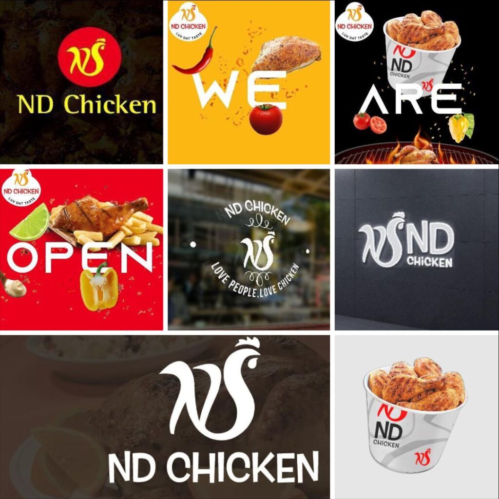
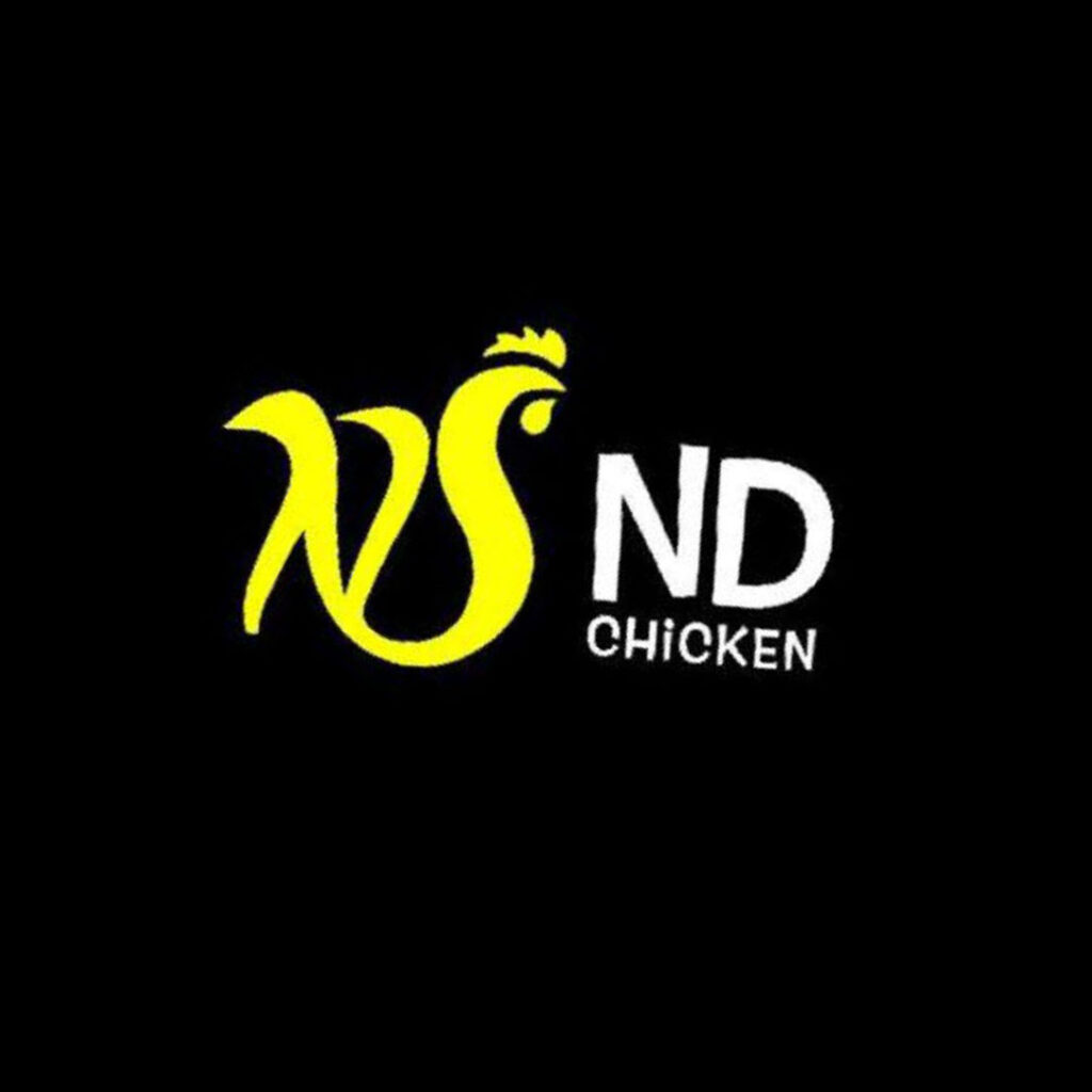
Fusing the initials of the two founding sisters, we crafted a distinctive logo for their chicken-based brand by forming a chicken shape from the letters “N” and “D.” To stand out in a competitive market, we opted for bright red and yellow colors, ensuring the brand would catch attention. This bold branding approach proved successful, helping the brand differentiate itself and attract customers. With its eye-catching logo and vibrant colors, the brand quickly gained traction and became a standout player in the industry.