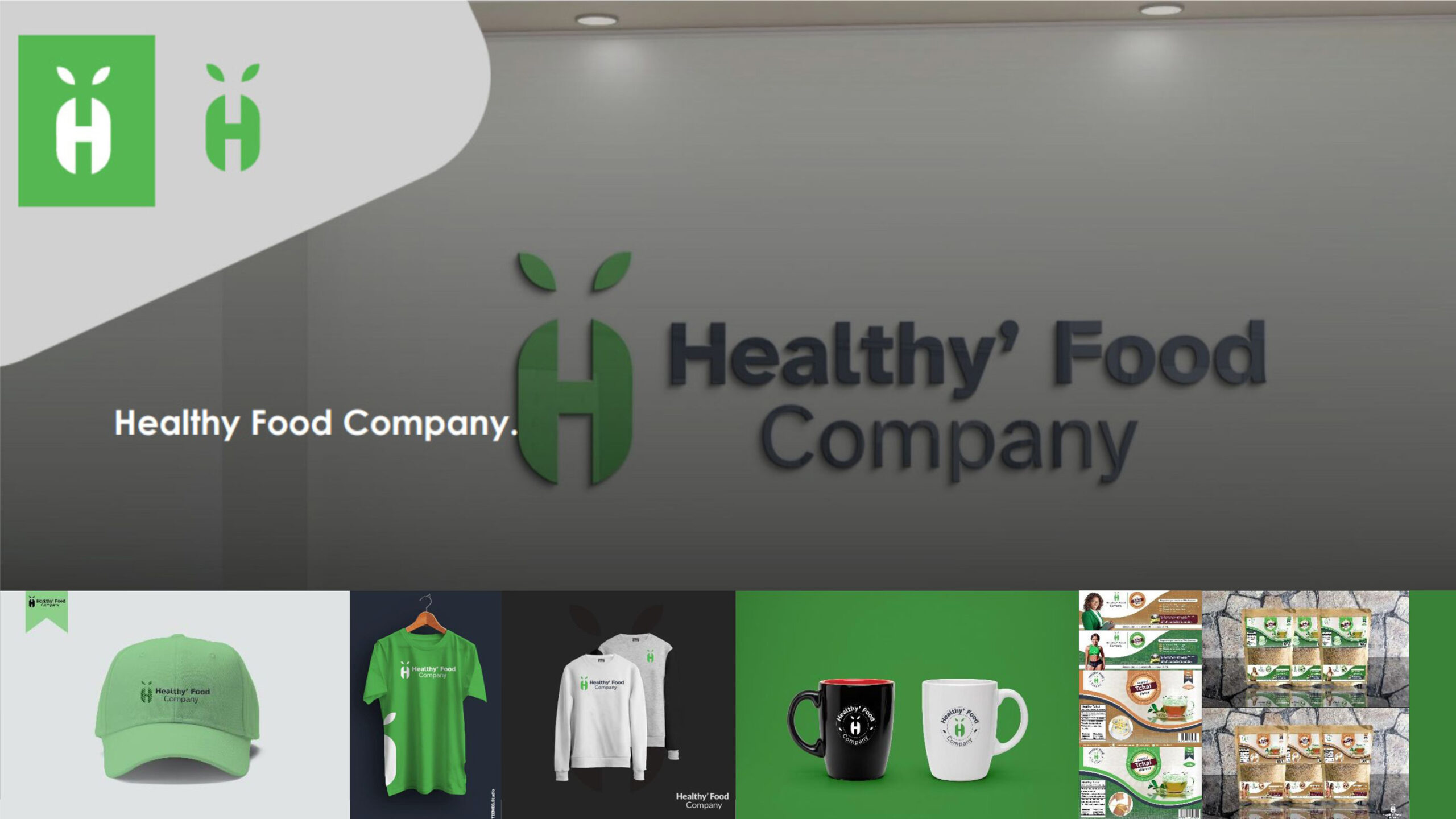
For the Health’y food brand, we’ve crafted a logo centered around the letter “H,” subtly incorporating elements that evoke a sense of food, represented by the leaf-like corners. This design captures the essence of health and nature while maintaining simplicity and elegance. The use of green and white colors further reinforces the brand’s focus on health and freshness. In addition to the logo, we’ve designed organic-feel packaging for the brand’s healthy tea products, enhancing the overall brand experience and conveying the natural goodness of the products within. Through its thoughtful branding and commitment to health, Health’y food brand aims to foster wellness and vitality through nutritious food choices.