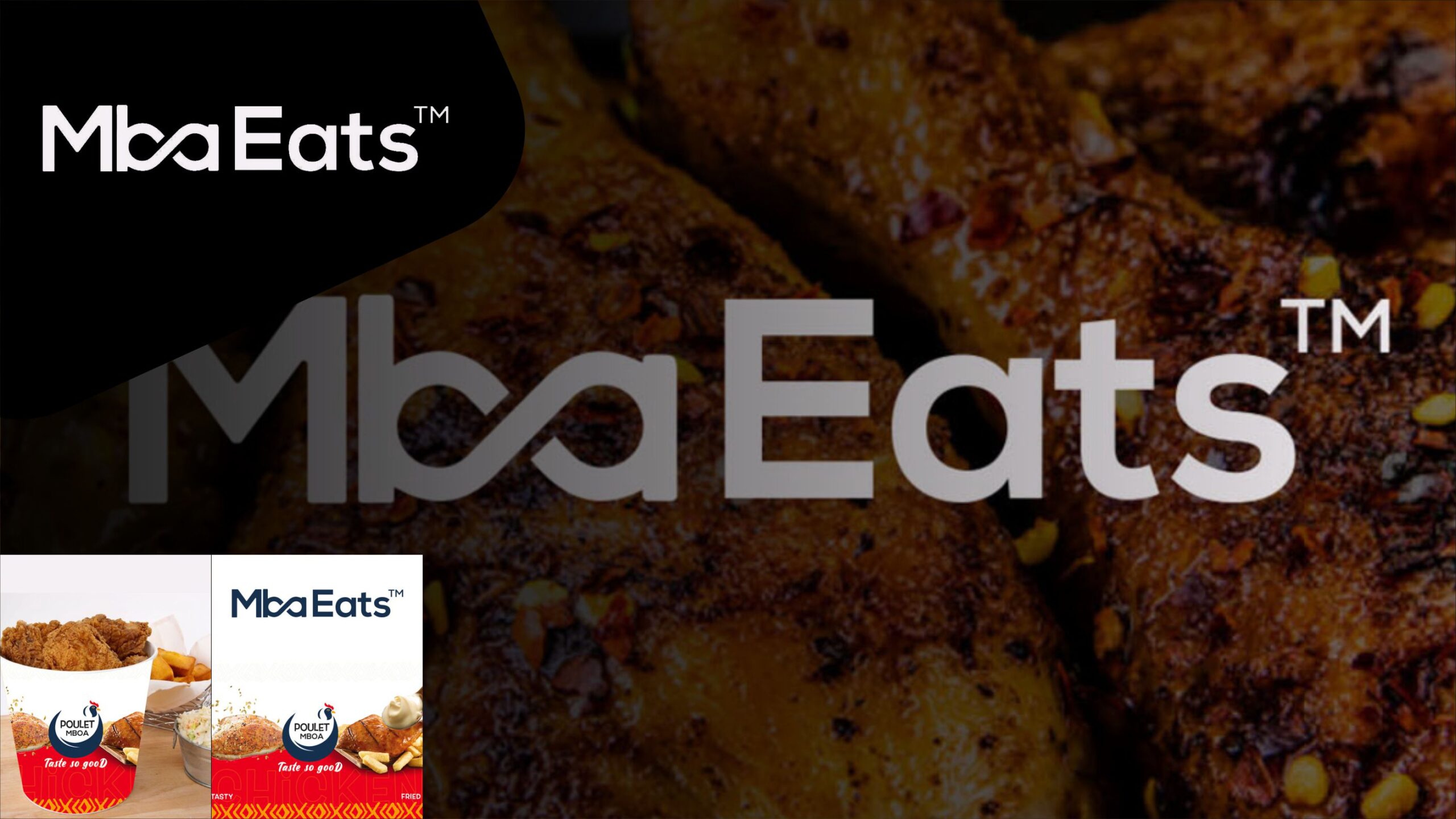
Mboa Eats, a fast-food tech brand specializing in chicken fries distribution, boasts a unique logo inspired by Cameroonian culture. The word “MBOA” takes center stage, with the letters “B,” “A,” and “O” cleverly fused to form an infinity loop, symbolizing endless possibilities and continuity. The logo’s minimalist and clean design exudes modernity and efficiency. Red and blue colors are chosen to represent vibrancy and professionalism. With its distinctive branding, Mboa Eats emerges as a standout player in the fast-food industry, offering innovative solutions with a touch of Cameroonian flair.