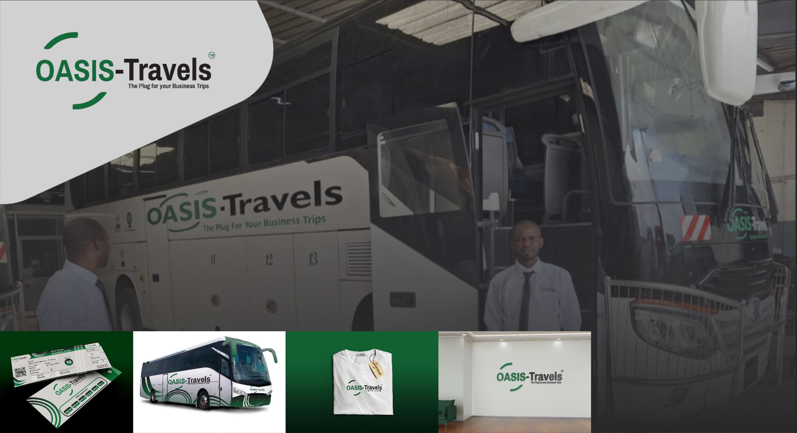
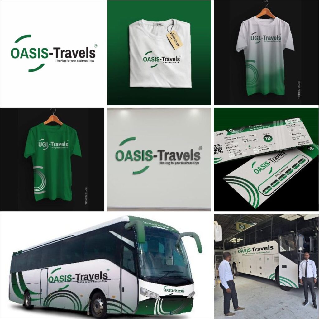
Oasis Travels, renowned as the premier choice for business trips, sought a logo that was simple yet memorable, setting it apart from the competition. We achieved this by seamlessly integrating the letter “O” into a steering wheel, symbolizing Oasis driving clients towards success in their business endeavors. This design not only distinguishes the brand but also makes it easily recognizable. The use of hereditary green and white in the logo reflects the company’s commitment to sustainability and readiness for the future. As a result, Oasis Travels has become a formidable and successful player in the travel industry, recognized for its reliability and dedication to client success